Views: 233 Author: Site Editor Publish Time: 2026-05-13 Origin: Site


A lot of clothing brands underestimate how much color affects a product until samples finally arrive in person.
A shade that looked perfect on a digital mockup can suddenly feel completely different once it’s printed on real fabric under natural lighting.
Most brands would build collections around:
black
white
navy
heather gray
and occasionally add one seasonal color for variety.
But over the past few years, color selection has become much more strategic.
In 2026, brands are no longer choosing colors based only on what “looks good.”
They are also thinking about:
how colors photograph on social media
how fabrics fade after washing
how prints interact with pigment dye
and how wearable the color feels in daily life
Some colors generate attention online but sell poorly in real production.
Others look almost boring on a moodboard yet become consistent best sellers once customers actually start wearing them.
This is why experienced clothing brands usually spend far more time testing colors than most people expect.
Because in apparel production, color affects far more than appearance.
It influences:
printing results
fabric perception
customer returns
and even long-term brand identity.
For years, pure black dominated streetwear.
But in 2026, many brands are moving toward:
washed black
faded black
vintage charcoal
sun-faded tones
instead of aggressive jet black.
One reason is visual softness.
Slightly faded blacks usually:
photograph better under natural lighting
work better with vintage graphics
and feel easier to wear daily
especially for oversized streetwear.
Pure black still works well for:
luxury basics
minimal brands
performance apparel
But heavily washed blacks now dominate many modern casual collections.
This shift also connects closely with garment dye and vintage wash trends that continue growing across both streetwear and outdoor-inspired fashion.
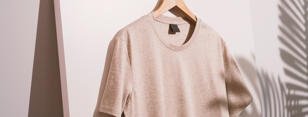
Bright white T-shirts always look clean in studio photos.
But many brands quietly avoid pure white for everyday collections.
The reason is practical.
Bright white often creates:
transparency issues
easier staining
stronger wrinkle visibility
especially on lightweight cotton.
In recent years, more brands have shifted toward:
off-white
cream
bone
soft ivory
because these shades feel:
warmer
more wearable
less harsh visually
Off-white also works especially well with:
vintage graphics
earth-tone palettes
washed printing effects
which continue trending heavily in 2026.
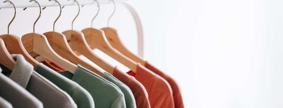
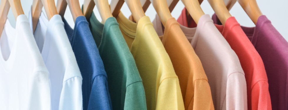
Earth-tone T-shirts have become one of the biggest long-term trends in modern apparel.
Colors like:
olive
sand
clay
faded brown
muted green
now appear everywhere from:
minimalist fashion
outdoor brands
luxury basics
streetwear collections
One reason is versatility.
Earth tones pair easily with:
denim
cargos
neutral sneakers
layered outfits
without feeling overly loud.
They also tend to age better visually than highly saturated colors.
Many brands discovered that extremely bright colors attract attention quickly online but often become harder for customers to style repeatedly in real life.
That’s one reason muted palettes continue performing strongly in repeat purchases.
Pigment-dyed T-shirts remain extremely popular in 2026.
Especially for:
oversized fits
vintage collections
premium streetwear
because pigment dye creates:
washed texture
uneven fading
softer visual depth
that regular reactive dye often cannot replicate.
But pigment dye also creates production challenges.
Color consistency becomes much harder across:
different production batches
fabric lots
and repeated reorders
This is why experienced manufacturers usually warn brands that pigment colors naturally vary slightly from batch to batch.
Ironically, many customers now prefer that inconsistency because it makes garments feel more vintage and less mass-produced.
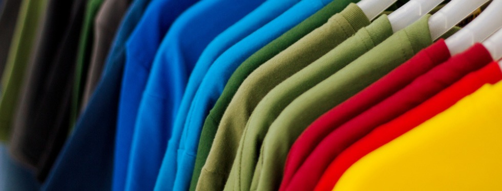
A few years ago, highly saturated neon colors exploded across social media fashion.
Now they are becoming far more niche.
Most premium brands are moving toward:
toned-down palettes
dusty colors
muted saturation
instead of extremely bright fluorescent tones.
Part of this shift comes from changing aesthetics.
But another reason is wearability.
Neon colors generate strong visual attention online, yet many customers struggle to incorporate them into daily outfits.
As a result, many brands now reserve neon shades mainly for:
limited collections
activewear
festival apparel
or seasonal drops
rather than core product lines.
This is something many beginners underestimate.
The same color can look completely different depending on:
fabric weight
knitting texture
dye process
wash treatment
For example:
A heavyweight cotton tee often makes dark colors appear:
deeper
richer
more premium
while lightweight fabric may make the exact same color feel:
thinner
flatter
cheaper visually
This becomes especially obvious with:
black
olive
vintage brown
washed gray
which react heavily to fabric texture and garment washing.
That’s why professional sampling is extremely important before bulk production starts.
This becomes even more obvious once garments go through washing, because some colors soften beautifully over time while others quickly start looking dull or uneven.
In 2026, color decisions are heavily influenced by content creation.
Some colors simply perform better in:
TikTok videos
Instagram photography
short-form product reels
For example:
washed black
faded olive
vintage gray
cream
often appear more textured and premium on camera than flat bright colors.
This partially explains why heavily washed tones continue dominating modern streetwear branding.
Some brands now even test garments under:
studio lighting
outdoor sunlight
iPhone camera footage
before finalizing color selections.
Because products that look good in real life do not always perform well online — and vice versa.
One of the biggest misconceptions in apparel is assuming all colors are equally easy to produce.
They aren’t.
Certain shades are far more difficult to maintain consistently during bulk production.
For example:
vintage black
faded olive
washed brown
often create noticeable variation between production batches.
This is especially true for garment-dyed products.
Some brands treat slight color variation as a production defect, while others intentionally keep those imperfections because overly uniform garment
dye products can sometimes feel too factory-made.
Others intentionally embrace those imperfections because they create a more authentic vintage appearance.
T-shirt colors are no longer just about aesthetics.
In modern apparel production, color affects:
branding
photography
print behavior
garment feel
and long-term wearability
The most successful brands in 2026 are not necessarily choosing the loudest colors.
They are choosing colors customers continue wearing long after the first social media post disappears.
Because the best T-shirt colors usually aren’t the ones that attract the most attention immediately.
The colors that perform best long term are usually not the loudest ones.
They’re the shades people stop thinking about — because they naturally fit into everyday wear without effort.